Image.net Redesign
User Research . UX Design Lead . UI Design . 2014
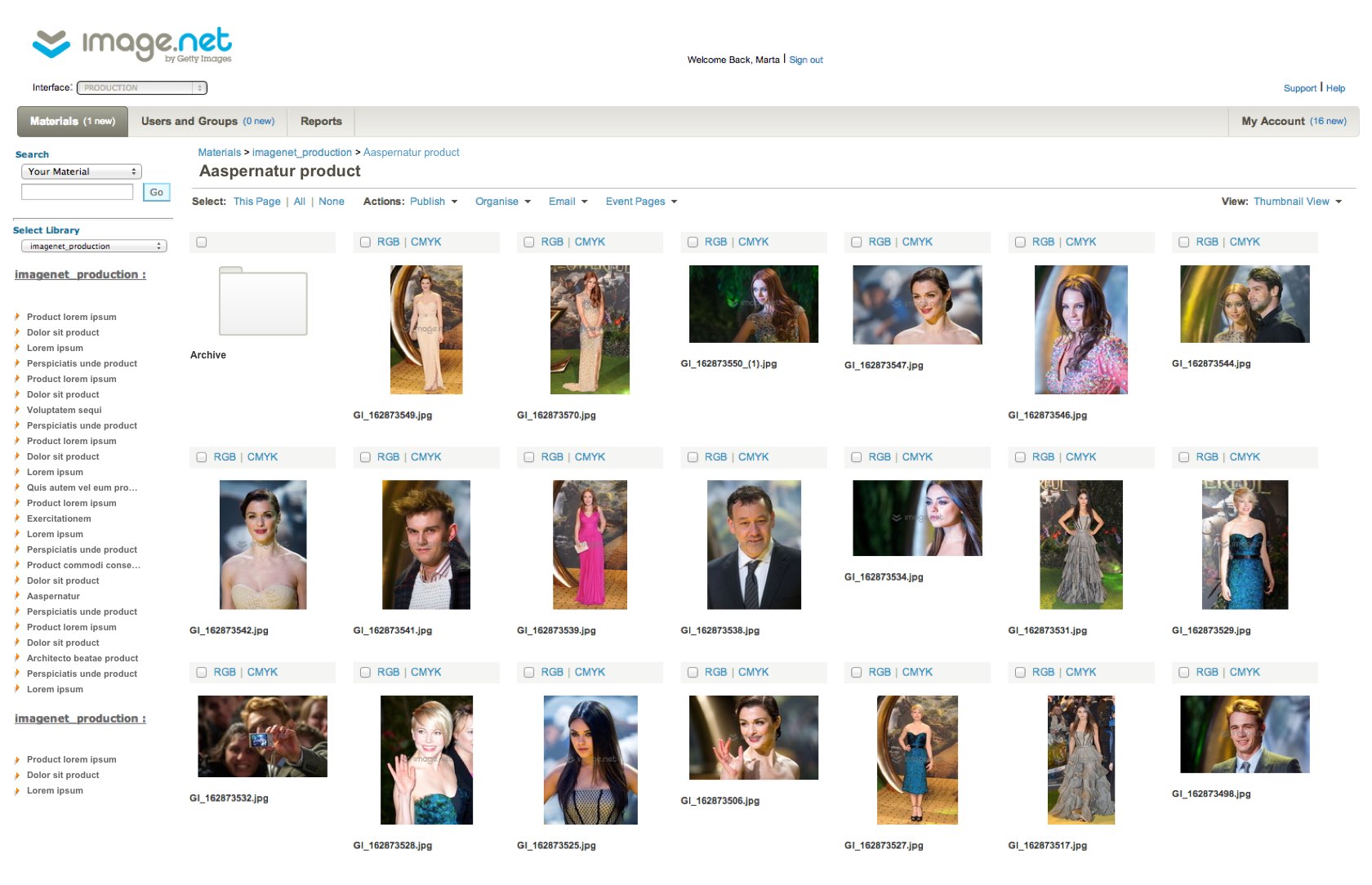
Image.net, a Getty Images product, provides free publicity photos and videos to the media. The site distributes content provided by industry clients, via a complex business facing portal. I led the UX effort to improve the overall user experience and address specific client concerns. In addition, I completed a visual overhaul providing suggestions for general site improvements.
The challenge
The current site had some challenging navigation and required a significant amount of time to onramp new users. The main user goals we pursued: moving images between folders faster, viewing folder permissions more easily, and approving access to images quickly.
Understanding the user
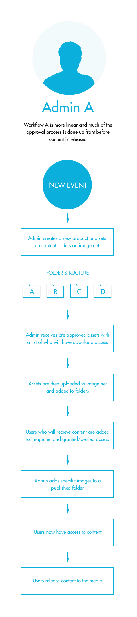
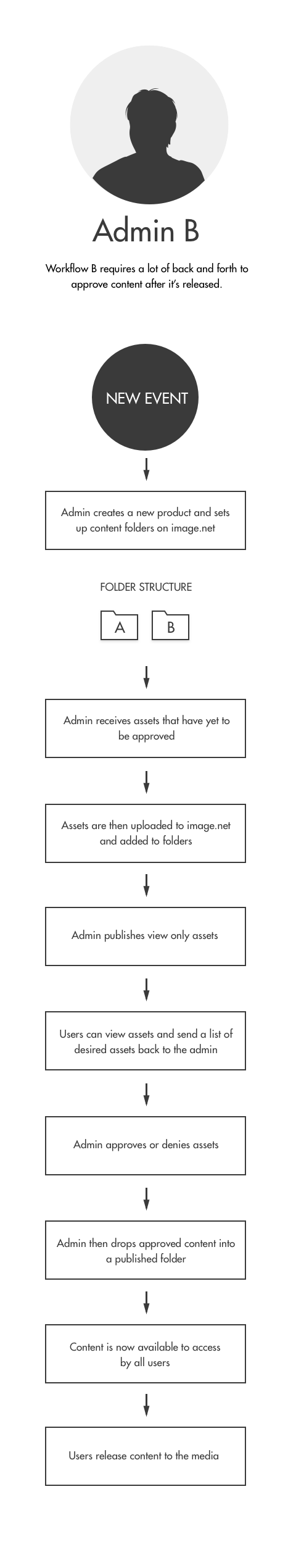
After interviewing our primary users on how they were currently using the site and their challenges, we established two primary workflows.
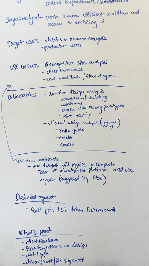
A challenging part of this redesign was that any changes made would need to benefit both workflows. One workflow involved approving a batch of images upfront and then releasing them to the media, while the other workflow required releasing individual images on a case by case basis.
Gathering user feedback
For this project, we knew early feedback was important, so we followed an iterative design model, with each design followed by a set of user interviews.
Study goals
- Continue to gather data around how our users work.
- Understand which design concept simplifies the user workflow.
Study questions
- Can you walk us through how you use image.net? Do you search, do you spend more time on the asset detail or folder level, what are some key actions you take regularly on assets?
- What are your general impressions with each design?
- You’ve just created a new project and uploaded assets, now how would you set permissions, view asset details, or publish content with each design?
- Anything else that can make these designs work better for you?
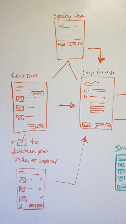
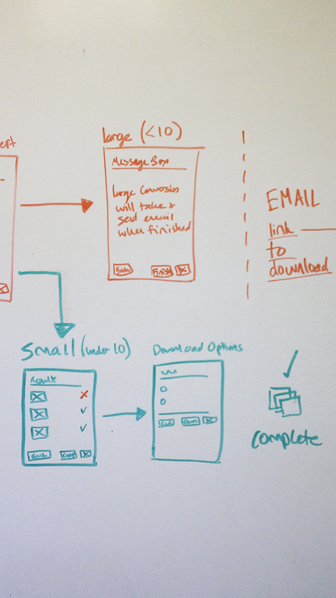
Design round one
For the first round of interviews we presented three design solutions to site admins that used the site on a daily basis.
I like being able to see the folder permissions easily, but figuring out how to get to them might be difficult.
We confirmed that providing folder permissions was highly desirable, but it needed to be clear how to access them. A simple “expand” or “close” control was not enough.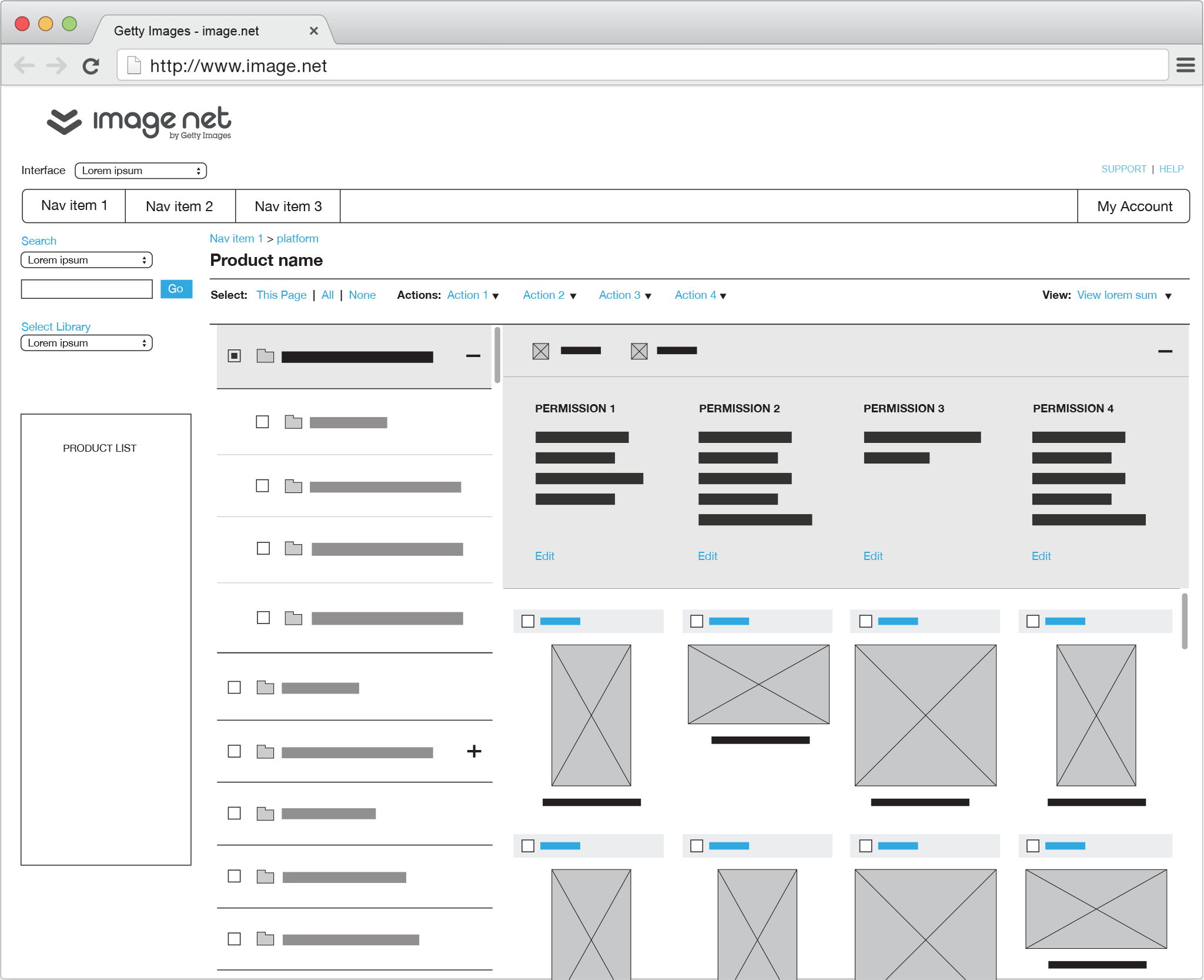
It’s really nice to be able to see the image thumbnails with the large image preview and folder structure at the same time.
We confirmed that viewing image details was just as important as viewing folder structure. The challenge was to figure out how to equally represent both without overwhelming the user.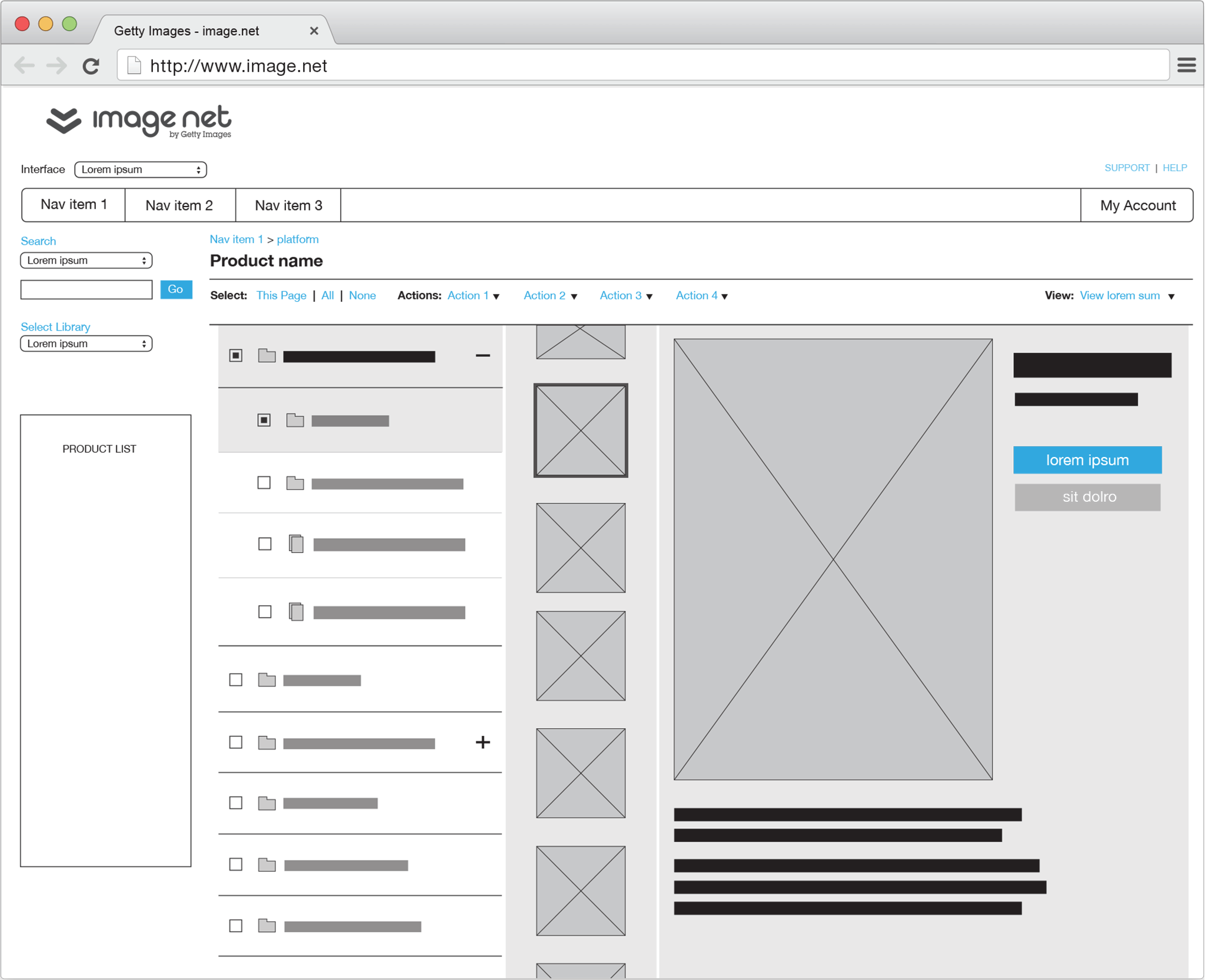
I think this design would be too cumbersome and difficult to click through these images.
Though this design is attempting to provide a way to scroll through images, we confirmed it does not fulfill the need to move through them quickly and approve or deny image access.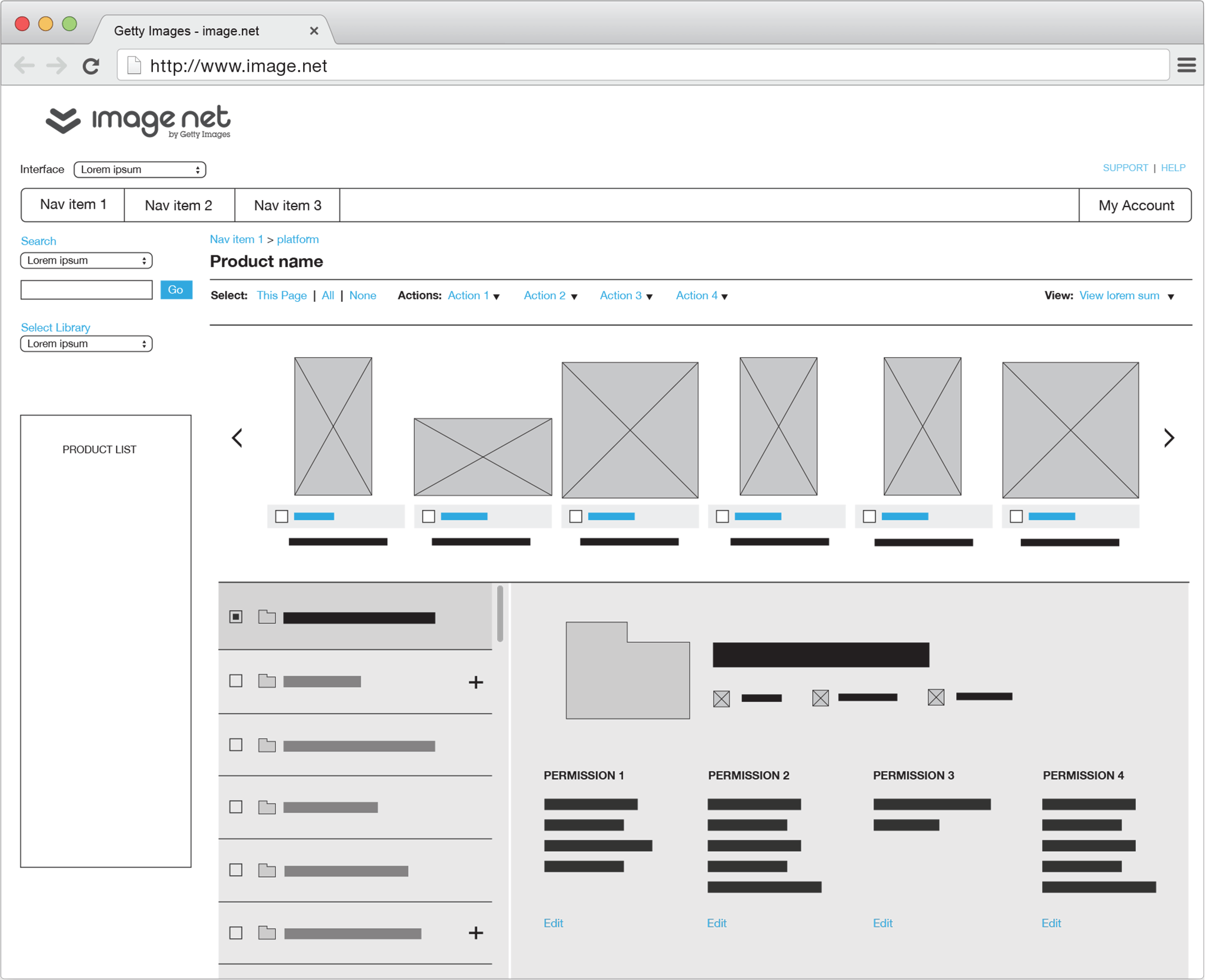
Design round two
For the second round of interviews we expanded the number of study participants, narrowed the design concepts down to two, and further refined the designs to help solve the primary concerns.
There’s a lot going on with this design and so many different levels, it’s starting to become difficult to find my place.
The benefit and downfall of this design was that we were attempting to display the entire folder structure. This was useful, but also provided a lot of information for the user to parse. We confirmed that assets and folders were higher priority than navigating between products.
It’s super useful to have the image preview on the right, though I still want to be able to see the image at a much larger size.
Users preferred having easy access to image details vs. the folder structure and their permissions. They needed an even larger space in which to properly view the image.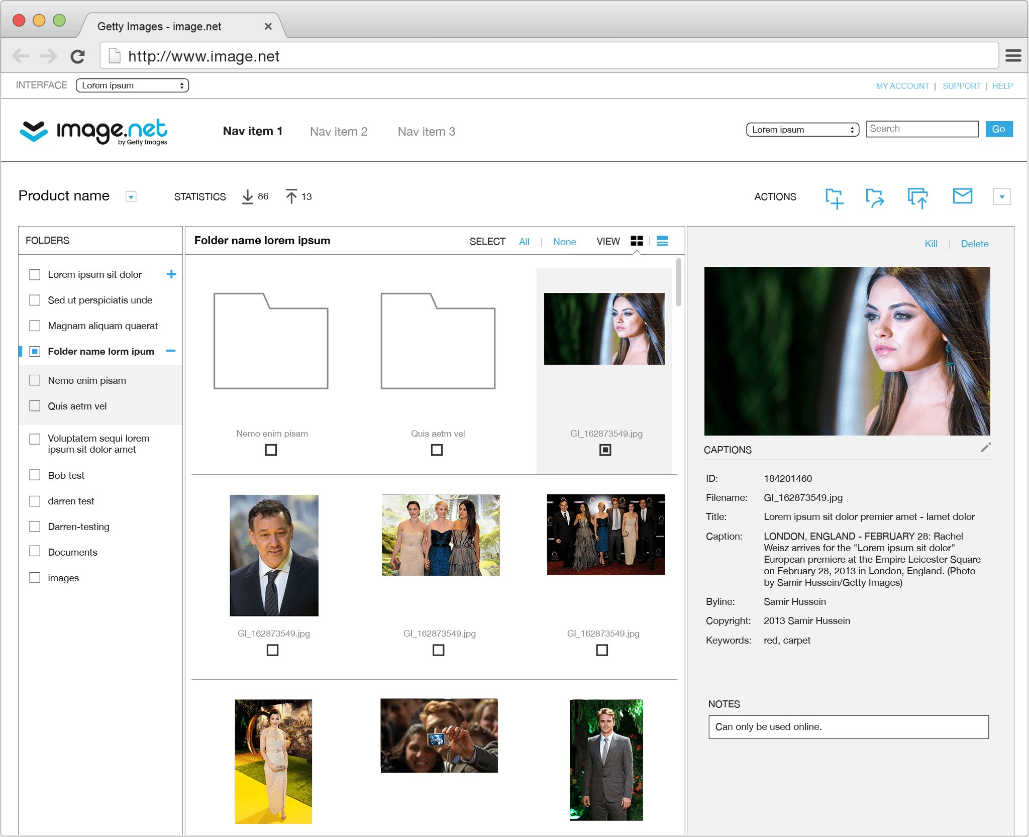
Applying the visual layer
As we moved to visual design, I defined a visual language based on the current structure but with a modern, fresh take.
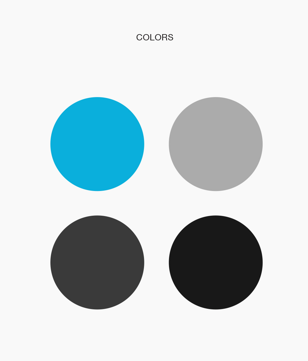 The applied color palette with updated greys.
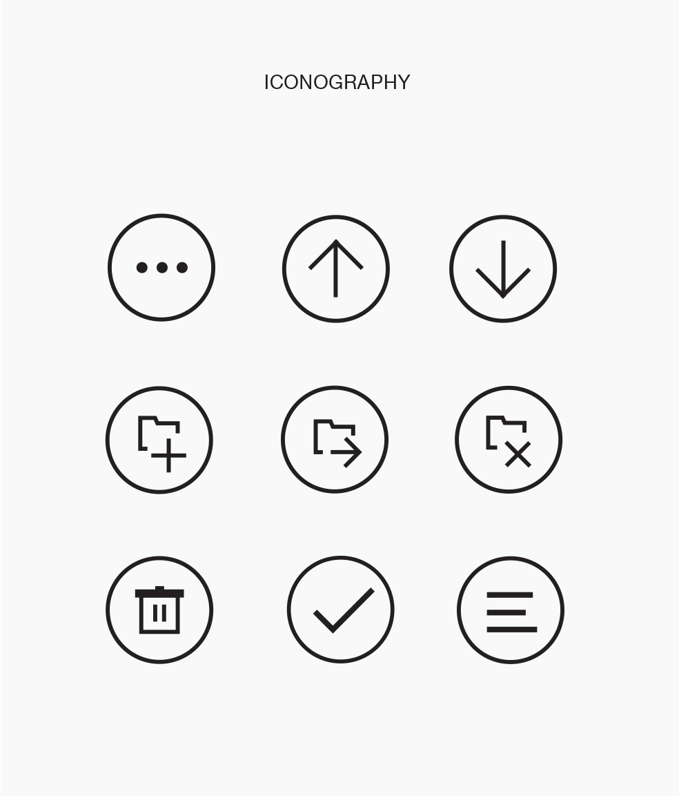 Custom set of icons, with a larger more tappable footprint.
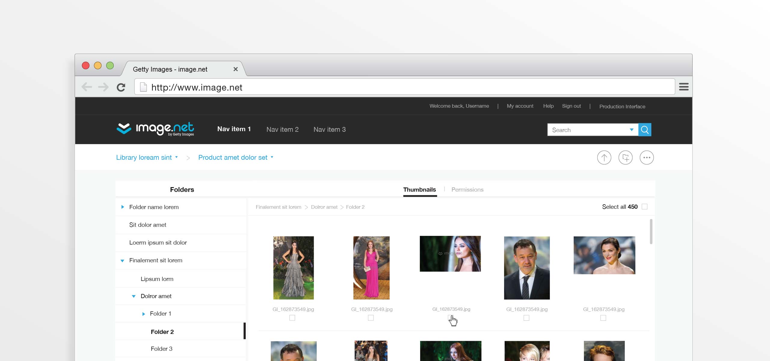
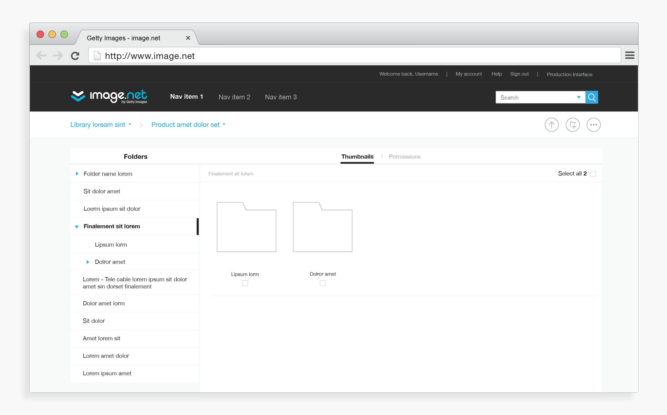
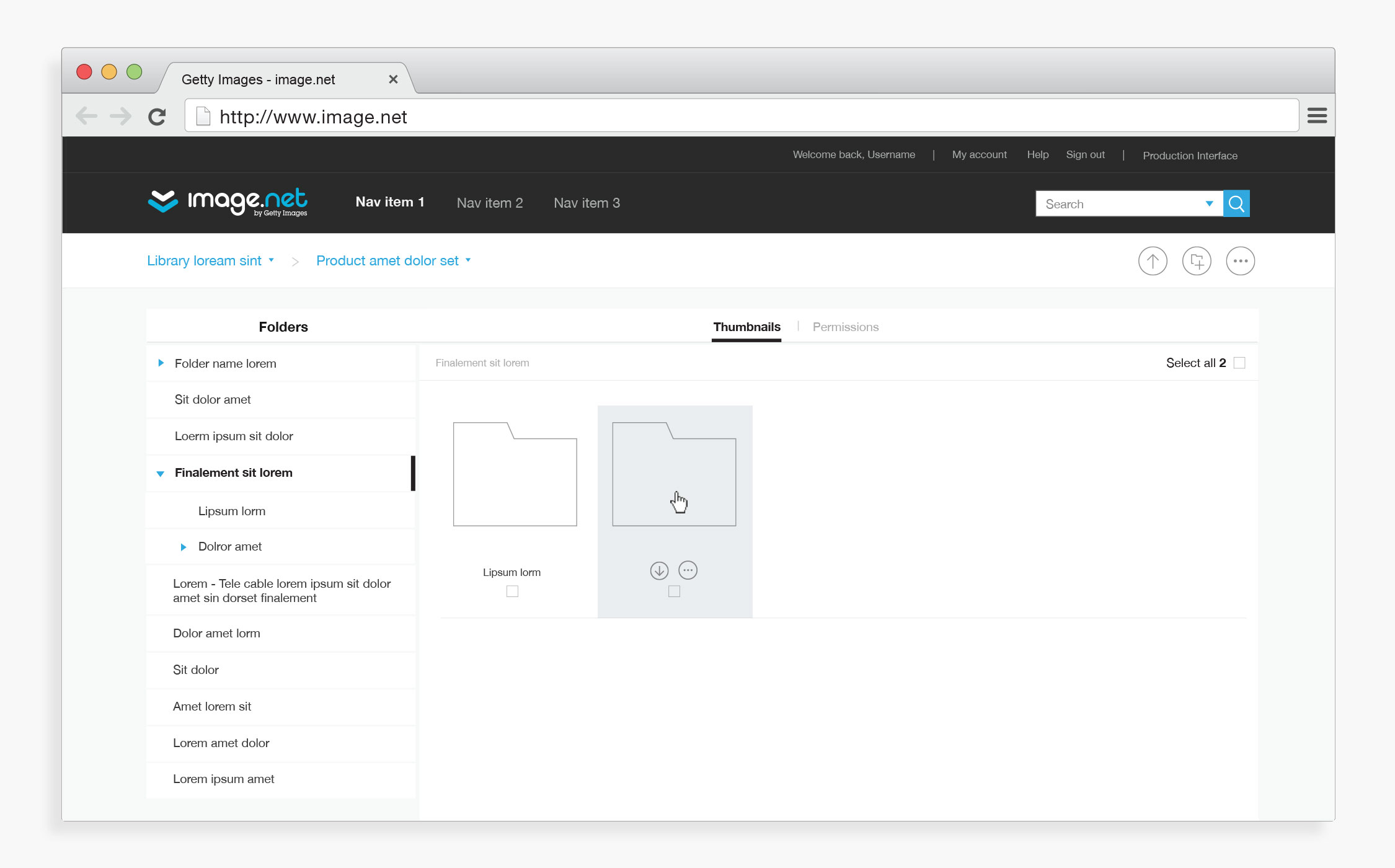
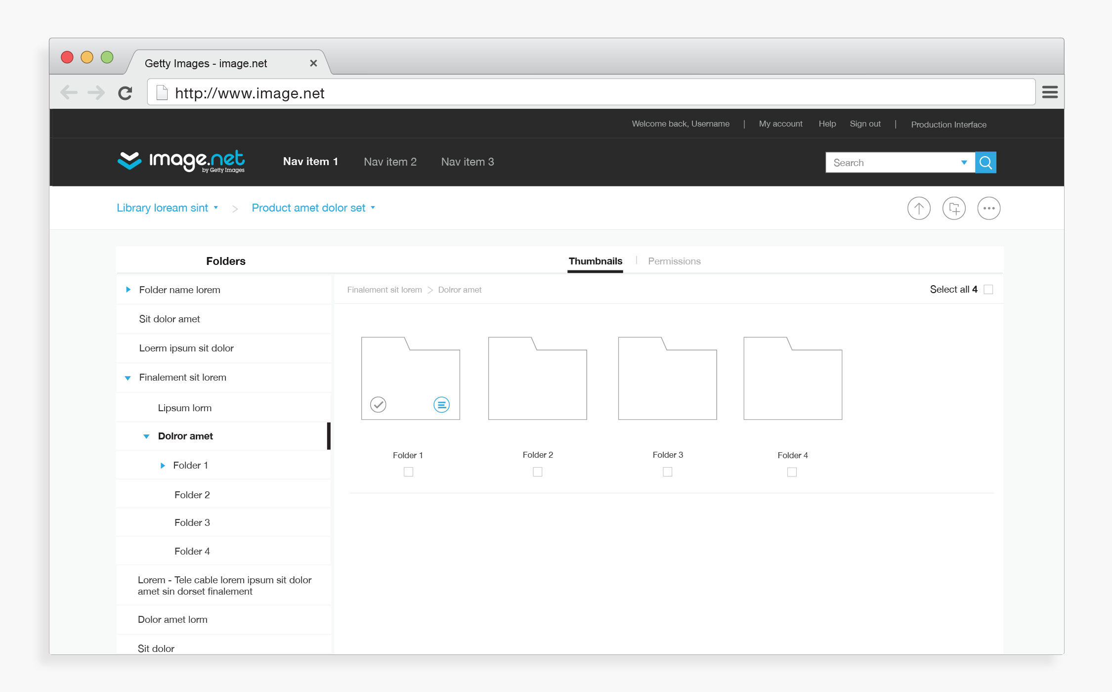
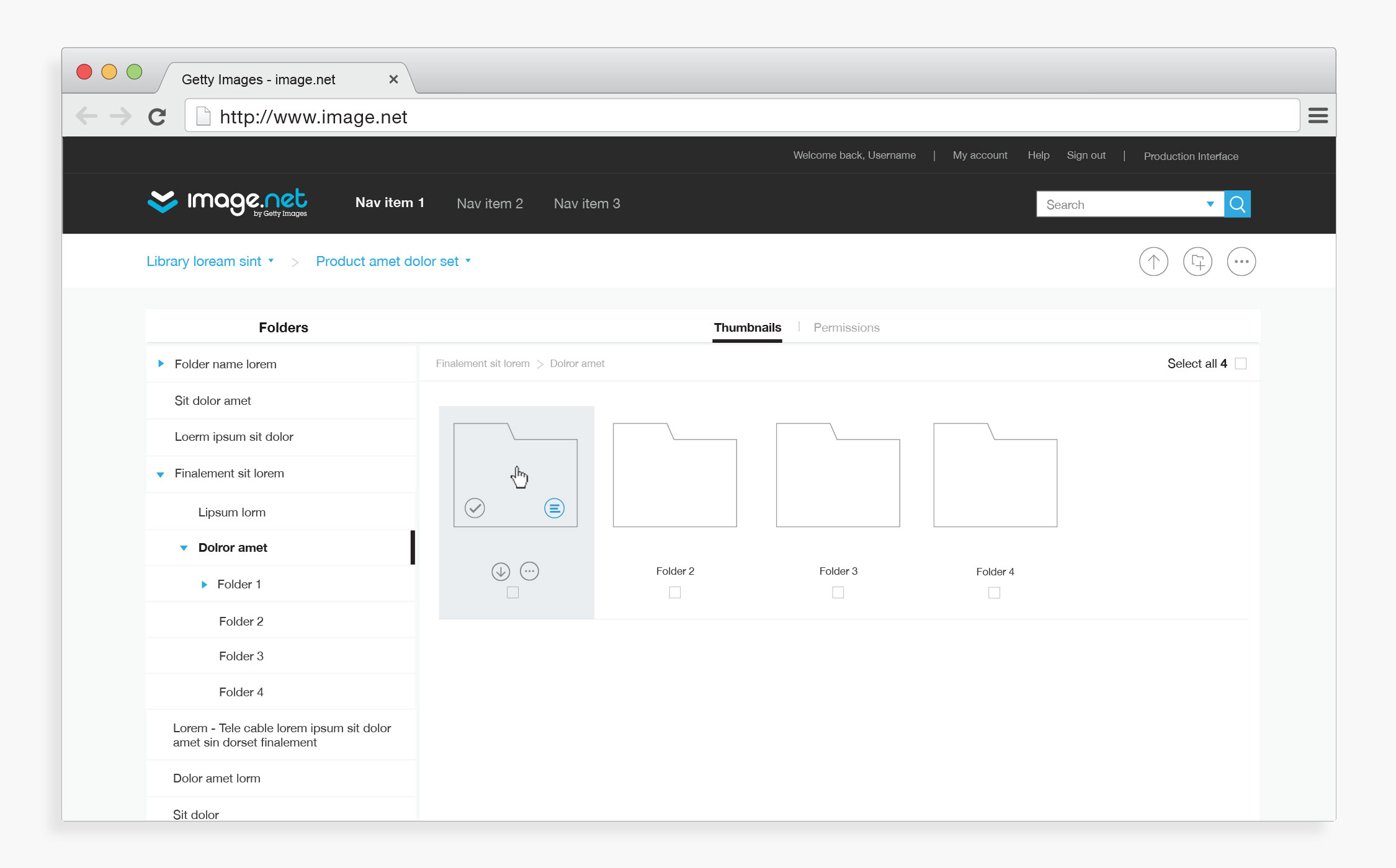
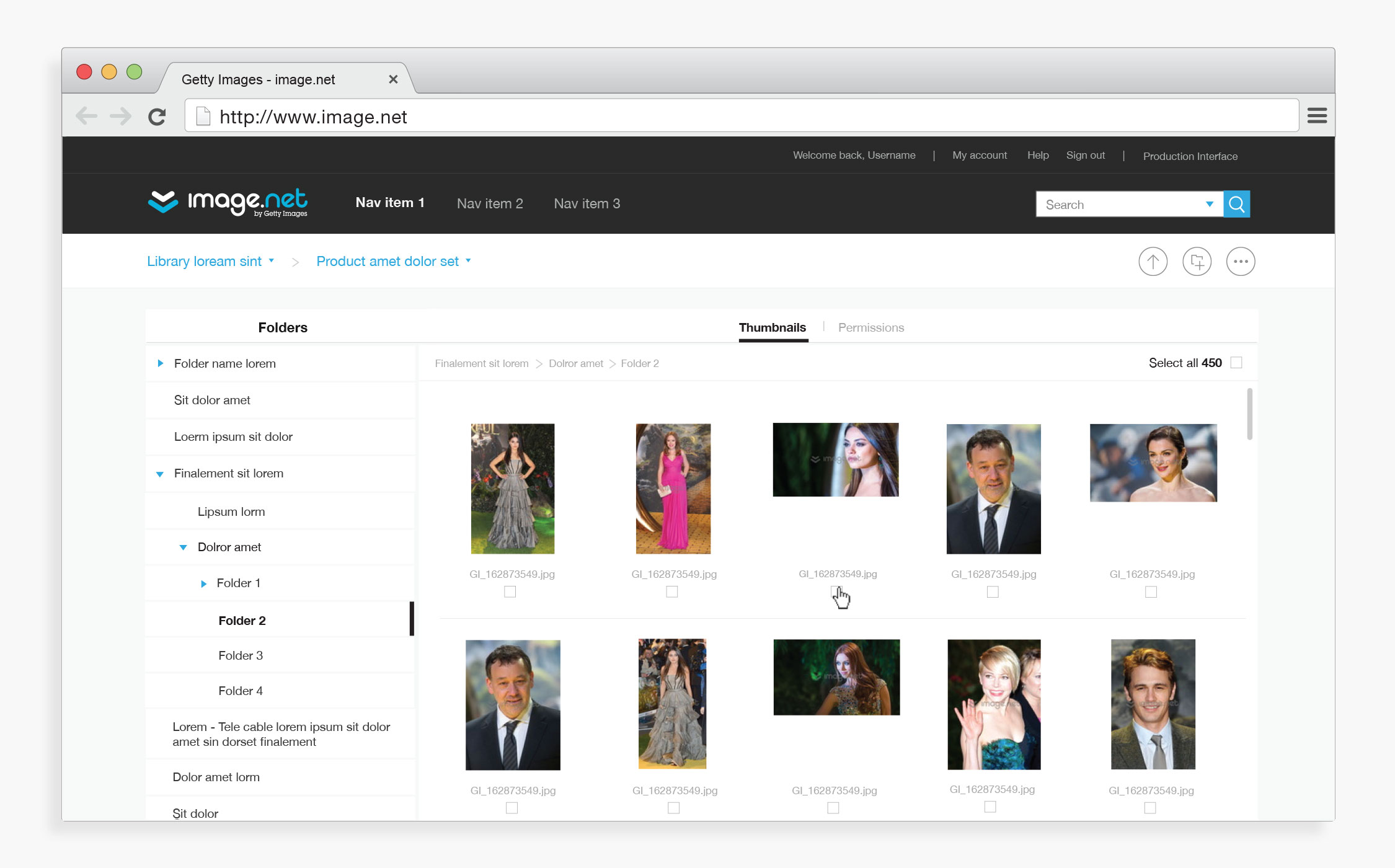
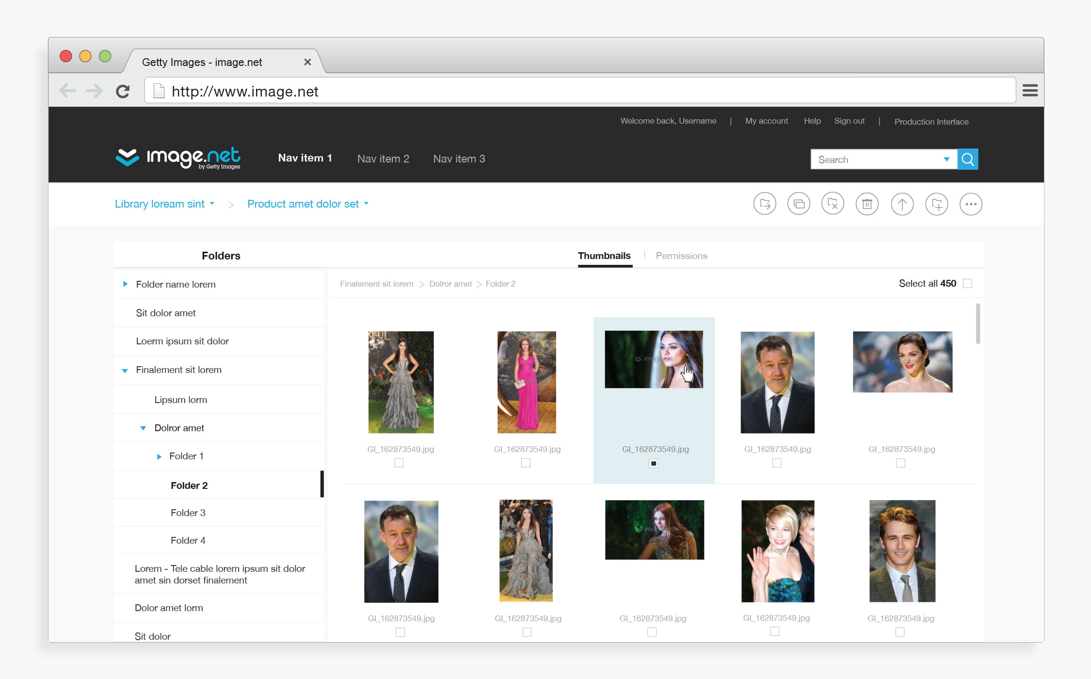
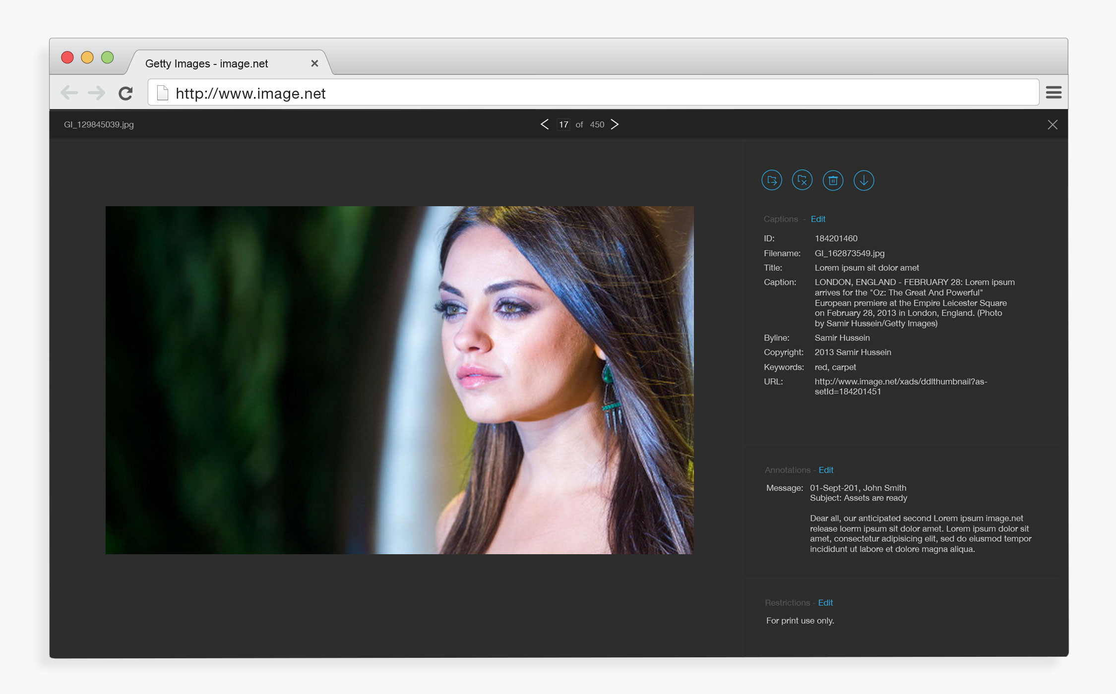
Finalizing the design
After testing we landed on a final design that had a toggle to swap between images and folder permissions, a full screen image preview to analyze and approve images, and collapsed product list in a top level menu.
More Work
iStock - iPad App
Getty Images - Employee Portal Update
Experimental Typography
PicMonkey - Mobile Touch Up