Touch Up Mobile
Lead UX Design & Research . Project Management . 2017
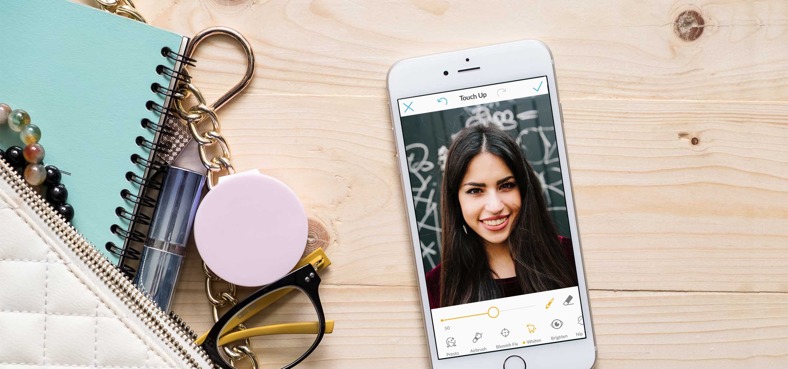
One of PicMonkey's most popular photo editing tools is Touch Up. This tool on picmonkey.com makes super complicated Photoshop tricks a breeze. It was a no-brainer to add this feature to the PicMonkey mobile app. I was the design lead for this project and worked closely with product managers and engineers to launch the Touch Up tool for mobile.
The challenge
This new feature would include the most popular Touch Up tools from PicMonkey.com, while adding new features like facial recognition to improve the experience. From the business side this new tool would be an opportunity to monetize the app by making Touch Up a paid feature.
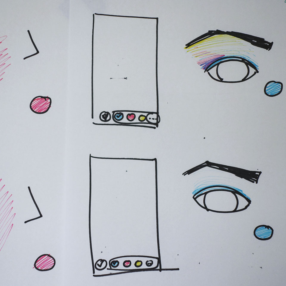
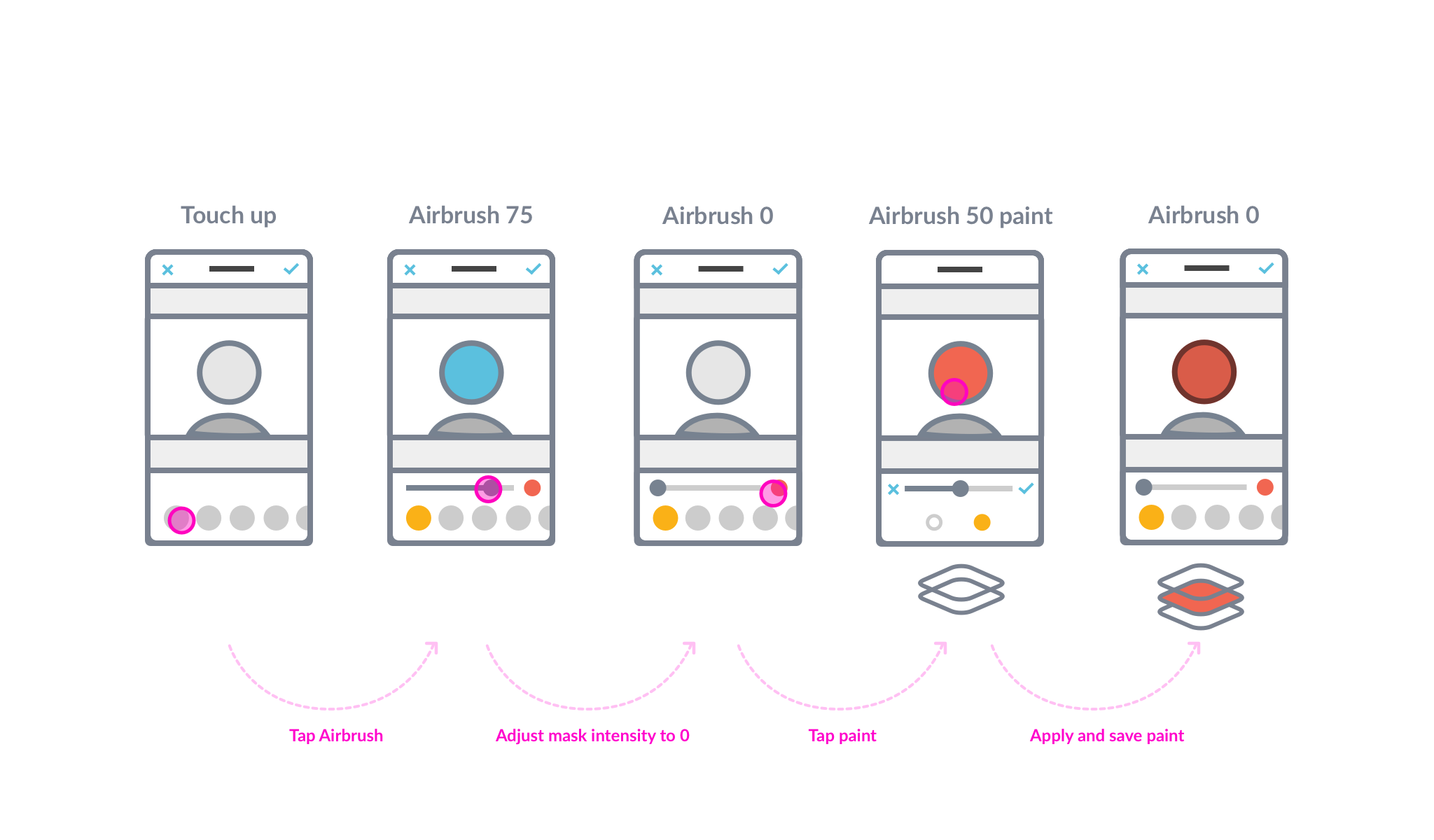
With engineering input, I explored how colors and gradients would work with facial recognition.
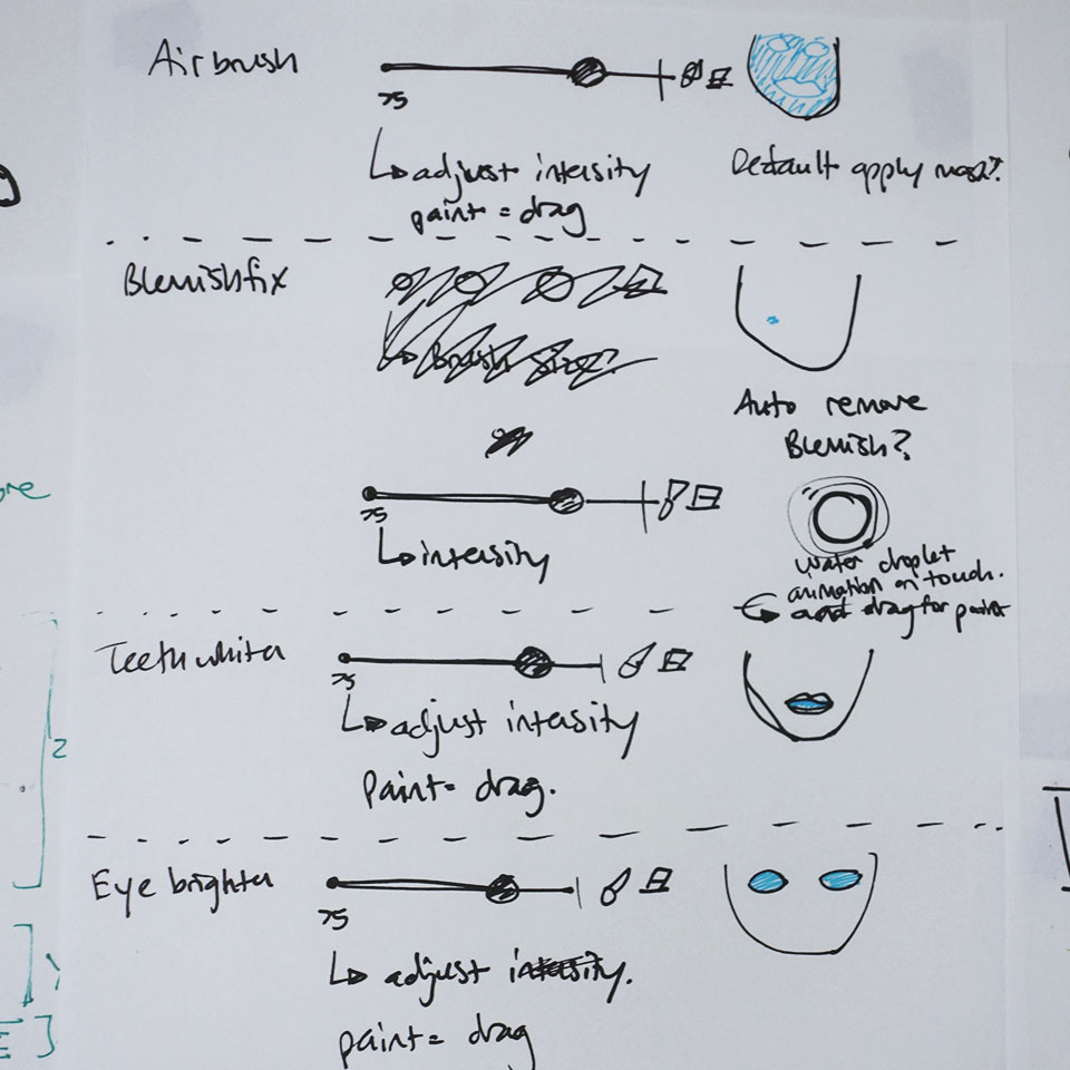
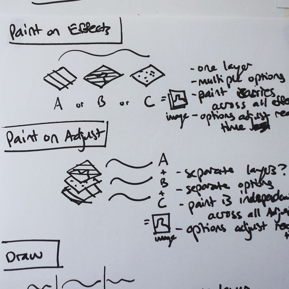
I mapped out gestures and controls needed for each Touch Up effect.
One of the biggest design challenges was fitting the new features into the current app's tool language. It was important to reuse controls found in other parts of the app, like adjustments or effects, so our new features would feel familiar with a small learning curve.
Defining the feature set
After diving into the possibilities of the technology with engineering, I recommended the features that were required to take the product to market.
Mapping out features
As engineering built the underlying technology based on early brainstorming, I began to finalize the user interface and work through emerging cases. I started with loose wireframes and—as designs became final—moved into visually complete mocks.
Gathering user feedback
We did one round of internal usability tests before finalizing the product. Fortunately, we had
several PicMonkey employees new to the project that frequently used touch up apps on their mobile device.
When conducting the studies, I got the entire team involved and asked a mobile developer to partner
with me during each study to take notes and observe. This was super valuable in increasing everyone’s
awareness of usability concerns.
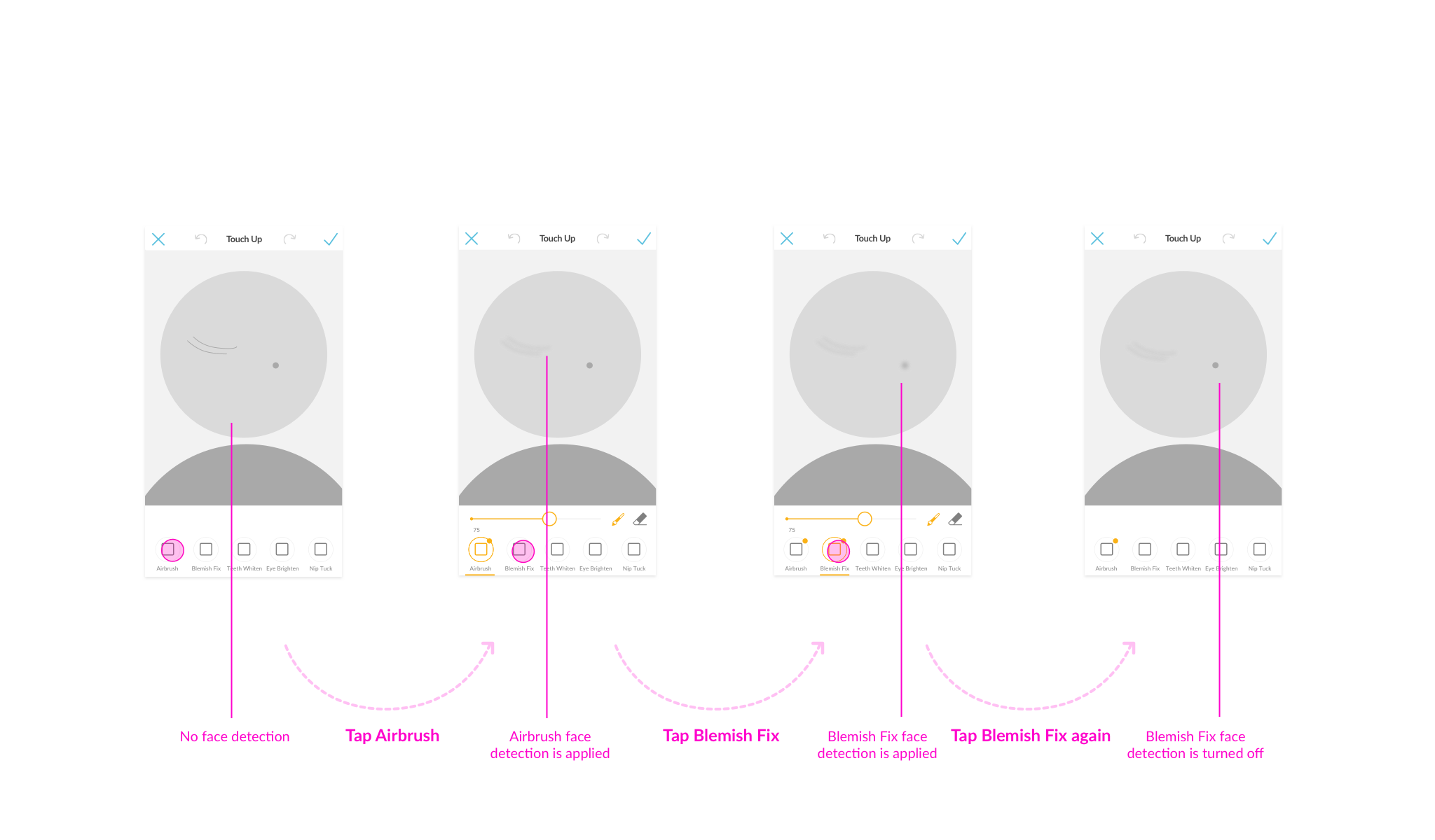
It’s really subtle and I’m not sure that something happened.
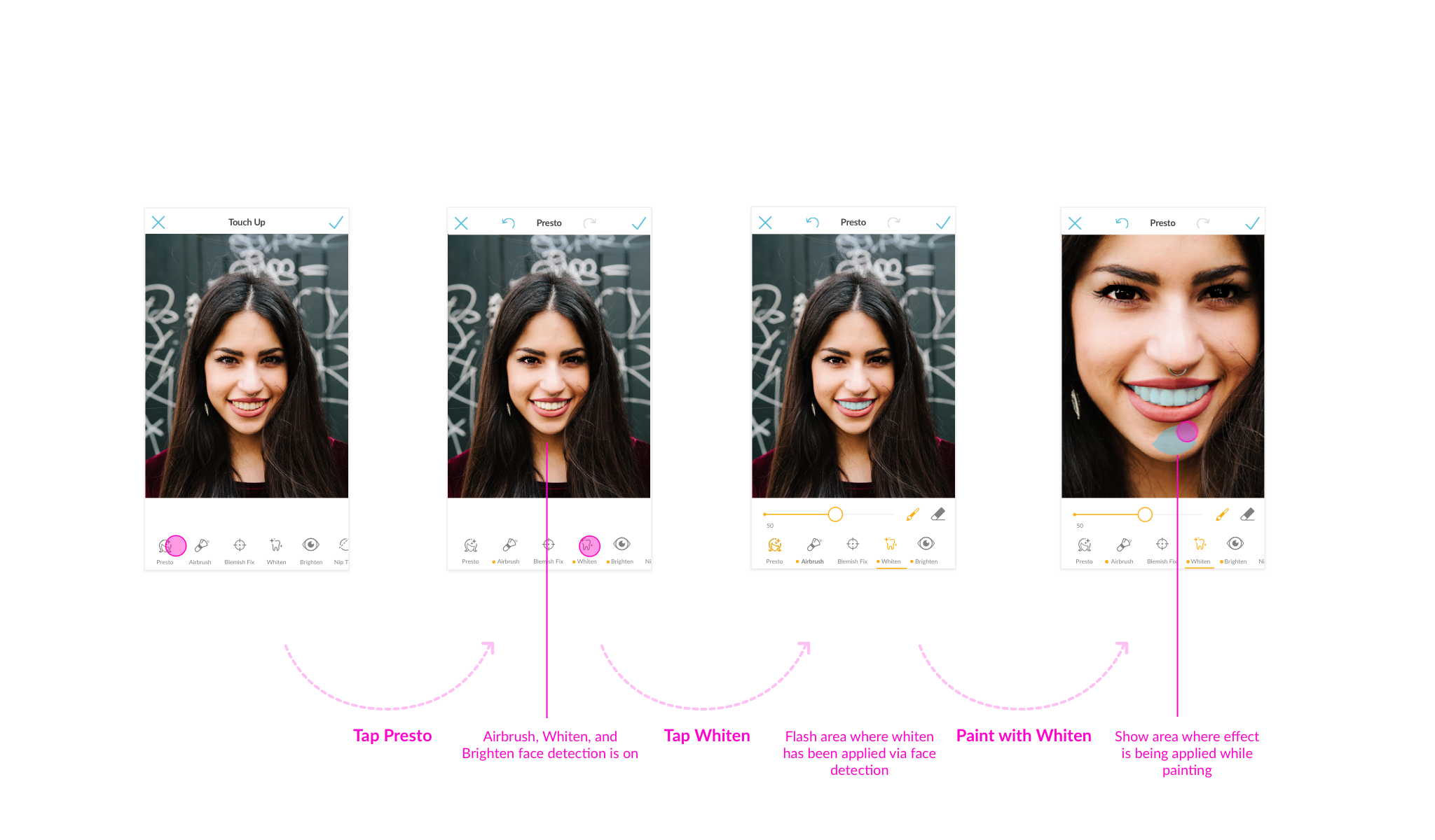
When users tapped on the facial recognition tool to automatically apply Touch Up there was no obvious feedback that something changed on the photo. We added animation that played after each tap to indicate the change. In addition, the icon shifted color to show the increase in intensity.I’m not sure about auto applying the effect, I want to pick and choose where to apply it.
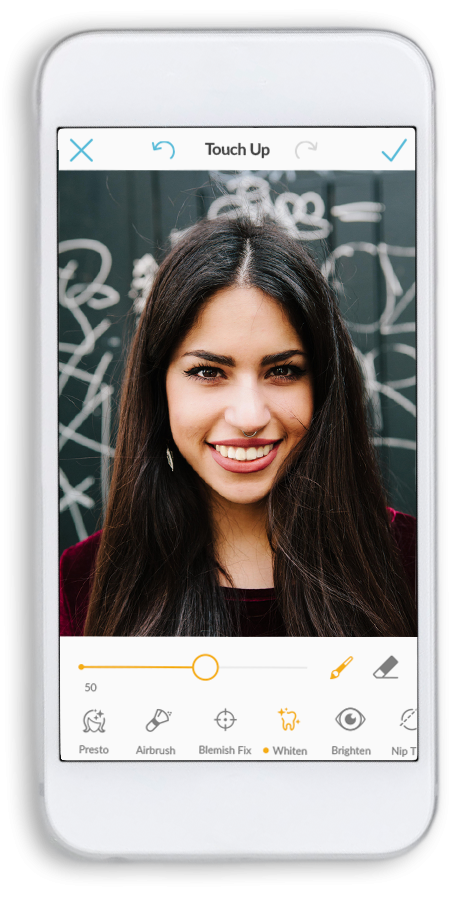
Half the users we tested liked using facial recognition by default, but the other half wanted the choice. We decided to separate facial recognition into a tool called “Presto”, that would turn on the automatic application. Tapping a tool, like “Whiten”, would only allow one to manually paint on the effect.I want it to move more with my finger. I can barely see what’s being done.
Nip Tuck, specifically "Melt", was a tool that perplexed all of the users we tested with. It wasn't clear what was happening nor how to use it. After the study, I partnered with the engineers to brainstorm how to adjust the tool so it was more sensitive with a dramatic effect. We also added a touch indicator to establish that the other tools of Nip Tuck, "Reduce" and "Fill", were tap-only effects, while "Melt" was a paint-only effect. Lastly, we changed the name of the tool from "Melt" to "Nudge" to indicate the effect outcome.Key takeaways
In the end this feature was really fun to use, and balanced complexity with ease of use. As our first monetized component in the app, we learned that we have higher conversions if we put a hard paywall in front of a paid feature vs. offering an option to try it before purchasing.
More Work

PicMonkey - Mobile App

PicMonkey - Mobile App
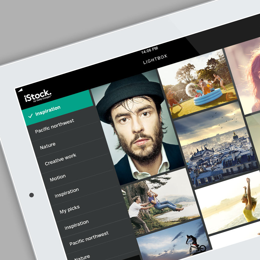
iStock - iPad App
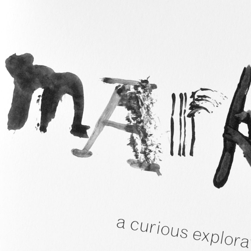
Experimental Typography